Choosing Timeless Colours for Your Home
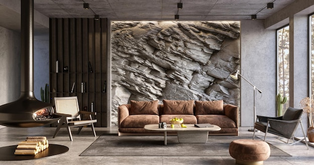
A lasting colour scheme is less about choosing a shade that never goes out of fashion and more about creating a home that feels balanced and comfortable over time. Start with the character of the space, the light it receives and the materials already in it. These details can guide a palette that feels personal without relying on short-lived trends.
Begin with a flexible base
Soft whites, warm neutrals, muted greys and earthy tones can provide a calm foundation for many interiors. The right choice depends on the room: a warm neutral may sit naturally with timber and natural fabrics, while a cooler shade can complement crisp finishes and stone.
Look at undertones as well as colour names. Two shades described as beige, grey or white can have noticeably different hints of pink, yellow, green or blue. Compare paint samples beside flooring, worktops, upholstery and woodwork so the overall combination feels considered.
Take the light into account
Natural and artificial light can change how a colour appears. A shade may look different in a bright, south-facing room than in a space with less daylight, and it can shift again under warm or cool light bulbs.
Before committing, paint sample patches on more than one wall. Observe them at different times of day and alongside the room’s furnishings. A larger sample is often easier to judge than a small card, particularly when choosing a subtle neutral.
Add colour with intention
A restrained base does not have to mean an entirely neutral home. Introduce deeper or more distinctive colours through a feature wall, painted joinery, artwork, cushions or other elements that can be changed more easily than large surfaces.
Consider how rooms connect, especially where one space is visible from another. Colours do not need to match throughout the home, but repeating a few related tones can help the scheme feel cohesive. A consistent undertone or recurring accent may be enough to create that connection.
Match colour with finish and texture
The finish of a surface affects the way colour is perceived. Matte walls, glossy tiles and painted woodwork can reflect light differently, even when their colours are similar. Texture also adds depth: linen, wool, timber and stone can bring variation to a palette without introducing many new shades.
Think about how each room is used when selecting finishes. Practical considerations such as cleaning and wear matter alongside appearance, and product guidance can help you choose an appropriate finish for each surface.
Make the scheme your own
Timelessness should not come at the cost of personality. Choose colours that work with pieces you intend to keep and that feel comfortable to live with. If you are unsure, begin with a small sample area and assess it in the context of the room before making a wider change.
A thoughtful palette is built through observation and balance: a flexible foundation, colours that suit the light and materials, and personal accents used with care.